Monday, 3 May 2010

EVALUATION

For this project we had to plan and produce a niche music magazine. I chose to create an indie rock music magazine aimed at young males. To develop a professional looking magazine I researched already existing magazines and analysis their conventional features. The first convention I conformed to was having a large title block placed at the top of the page. like the other magazines I observed during my research I made my magazine title big and bold, this is to allow the reader to easily recognise the magazine when under shelving conditions where the front cover may be slightly overlapped. I am aware that on some magazine the central image overlaps the title sometimes even to a point where the letters are barely visible, this is a technique used to focus all attention on the image. I have chosen not to do this because this is only the first issue and viewers are not yet familiar with the look of my title block. Only very popular magazines with an already establish consumer base can afford to not publicize the name of their magazine clearly on the front cover (Kerrang magazine does this very often). Throughout my magazine I have maintained a particular house style. I achieved this by predominantly using the three colours grey, green and white. I have also used the same eroded fonts which I obtained from 1001fonts.com. I chose these particular colours because the darker tones represent an urban environment whilst the green sharply contrasts and looks unique against it, much like how indie music is a source of shinning talent within major cities. I have challenged conventions using my central image, normally on a rock music magazine you would expect to see a more rebellious pose from the artist (similar to Gerard Way’s pose , however here I have used an image where the artist forms a calmer mode of address with the audience. This is to convey him as a normal person rather than a person and put him and the reader on the same level which I hope engages the reader. I aim to create a community between the readers/fans that go out to all the festivals to support small time acts.

Rock in general is a vast and popular music genre that has sparked thrill and excitement within the hearts of the young for many generations. The popularity of rock music spans worldwide and has a very strong influence even in today’s culture. Modern society has been so heavily influenced by the entrance of rock music into the mainstream that even fashion trends and social attitudes have been affected. The music genre of rock being as broad as it is there are many subgenres that fall underneath its title, and each of them influencing their own subculture. The subculture I have aimed to appeal to with my magazine is that created by the Independent (indie) rock subgenre. This subculture, similarly to the many other rock subcultures, takes pride in rebelling against the constraints of society. In the case of this subgenre the artists take pride in maintaining complete control over both their music’s contents and its distribution. They tend not to join large record labels which are more interested in sales and profit rather than just the share fun of creating and sharing music for the sake of expressing individualism. Despite being aimed at a younger age I have decided to write my magazine in a serious manner (A trait more often reserved for a magazine aimed at the older buyer). I believe that most magazines that are aimed at the younger audience are patronising to a degree, and this portrays the younger generation as incapable of engaging with sophisticated text. I wanted to oppose this ideology and present information to my audience in a fun yet educating manner. In my magazine I aimed to portray the artists of indie rock in a positive and acceptable manner, not just to fans but also to people not as acquaint with the genre. My aim is not only to give praise to and promote the good artists but also to let people that might not know much about a band being discussed have an equally informing experience reading through an article. I think I have achieved giving both the hardcore enthusiast and the casual listener of indie the same sense of belonging with my magazine mainly through the way I structured my article. In it I used both proper (“Mike Saunders”) and colloquial terms (“Izzie”) to refer the artist featured in my article.


My magazine is based on the single topic of Indie music. So when researching possible companies that might distribute my product I took into consideration that I need to find a company that is both based in the UK and are known for their niche magazines. At first I considered IPC Media they are an immensely popular publishing company based in the UK, but they are the distributors of the very poplar rock music magazine NME which is a more mainstream rock music magazine that covers many of the subgenres of rock. After my research I concluded that the media institution most likely to distribute a magazine such as mine would be Future. They are the third largest special-interest consumer publisher on the UK news stand and the no.1 licenser and exporter of monthly magazines in the UK. Future publish a number of specialist-interest magazines ranging from the more common interests such as Games, Films and music to even things as mundane as cycling. Their list of already existing Music magazines include Rhythm magazine (for the drummers) and Metal Hammer (for the heavy metal rockers), which appeal to a very niche audience much like my own magazine. The ideologies of my magazine match that of Future’s publications. At Future they base everything on “communities of enthusiasts” and in terms of audience my magazine tries to attract the reader who is passionate about the topic of Indie music. Publishing Magazines is not the only thing the company does. They also own a vast number of websites and take charge of organising events. This provides many opportunities for my magazine as Future can not only help provide a website for the viewers of my magazine to view but also help organise live music events which I feel would perfectly portray what my magazine aims to do, which is celebrate Indie music.


The audience for my media product is primarily males ages 14-22 that live in the major cities in the UK and share an interest in Indie Music and the musicians (old and new) that contribute to the genre. I have chosen to target this audience because at this age they are still students and I believe there is a gap in the market for a magazine that can boasts intellectually engaging articles. With my magazine I aim to abolish the rock star stereotypes and give realistic accounts and views based on different artists. Rather than talking about how many fan-girls throw their underwear at them whilst on stage, I want to discuss what inspires the artist’s and learn what their aspirations for the near future are. In doing so I hope to inspire a younger generation of musicians that may have similar aspirations by allowing them to relate to established musicians despite their level of fame.
Over the course of this media project I took advantage of two main technologies. Photoshop and Blogging. For them I have both learnt new skills and have improved upon my already existing ones. Presenting my work via Blog uploads is an experience I am new to. Prior to this course I had not ever used Blogspot.com, not even for social reasons. From doing this project I have learnt how to make multiple blogs and uploads text and images to them. I think Blogging is extremely convenient, this is because I can access and upload my work from anywhere provided I have an internet connection. It also gives others the chance to read and review the work I have done, and then from this feedback I can easily edit what I have done using the website. There were however a few problems I experienced with using blogs, for example, at some points I was not able to upload my work due to unknown errors. This was not my first time using Photoshop, however my knowledge of the software prior to this project was very basic. Photoshop is an amazing image editing software pack that is even used by the professionals in the media industry to alter and enhance images. From this project I have learnt how to custom crop and images using a combination of the lasso and pen tool, evidence of me using this skill is on my front cover where for the central image I removed the background to make it look like the image was taken in a white studio. Additionally I learnt how to use layers. Using layers in Photoshop allowed me to move objects around with ease, I could place them behind or in front of other objects and edit a layer individually. At first it seemed daunting due to the fact I was continuously making new layers, but for maximum control over the many objects I was using. To maintain order and control I organised different areas of the magazine into different groups of layers and named each layer so it would be easy to locate a specific one if editing is necessary.


When comparing my preliminary task to my final project it is clear to see that I have learned a variety of new skills. For the central image of my college magazine I simply went around the college and took pictures of the students I saw. For my music magazine I put a lot more thought into the construction of the central image. I organised a specific location, dress style and use of props. I did this with intention to clearly convey what the music magazine is about. However I should have put more thought into the actual poses chosen for the images, they don’t look as though they conform to a specific representation of the artist and are rather bland. Again when looking back at my preliminary task the cover of my college magazine I only conformed to the most basic of magazine conventions, the title block was at the top and it had a central image. With the AMPD magazine front cover it looks more feasible as an actual magazine cover due to the inclusions of the smaller conventions such as puffs, buzzwords and an overall house style. On the cover I have listed the names of popular idie rock bands, this is another clear way to appeal to the target audience because the more bands of particular interest to a person featured in one magazine, the more likely they are to buy it. On the front cover I believe the central image and the overall style attract the audience. The central image is of a musician (clearly denoted by the fact he is holding a bass guitar) which tells the audience that this is a rock music magazine, the style is mostly eroded mimicking an urban environment (this choice being inspired by Kerrang magazine’s own shattered masthead) and showing it is aimed at inner city kids. One the contents I have listen section based on what the interests of the average idie music fan. Festivals and Gig being of primary importance due to the independent publicity of most of the artists, also it is a good chance for the reader to hear new and original music.

Monday, 29 March 2010

Magazine drafts designs


First magazine draft design for contents page


first magazine draft design for front cover

Edited images


Images for magazine


Saturday, 27 March 2010

Feature article Draft

This issue we have an exclusive interview with the new solo artist Mike ‘Izzie’ Saunders. His music style is a clever fusion of hard rock and country blues which can be considered unique in this age of generic emo-pop. A fresh touch is exactly what we need; he also provides a reminiscent homage back to the days of now ancient rock, in other words considered to be the good stuff. The guy has already been proclaimed as the new age Jimi Hendrix, complete with big hair. This comparison is kind of a big deal for the young artist, after all jimi Hendrix is only considered to be one of the greatest electric guitarist of all time.

Before we dive right into the thick interview I think it is appropriate to acknowledge that Izzie’s solo carrer was not his first attempt to break into limelight. Before going solo he could be found playing the bass guitar in small band called the called "TheStandStill”.

Bands live then die out. Known fact. However the heights that a band reaches before finally being drowned out by an unforgiving wave of the newer rockers, is hard to determine. Only a hand full of great rockers such as ACDC, The Rolling Stones but most notably The Beatles, have managed to stand the test of time and changing fads. Others that don’t become as popular are reduced to but a near silent echoe.

TheStandStill consisted of 3 bands members. On lead guitar and vocals was terry McNavin, on Bass was our young wonder Izzie, and on drums Patrick Dufont. I remember writing a review on them after attending the London Numuzak festival which sampled the best up and coming artists on offer from a variety of genres. As a band they weren’t too bad, providing some pretty catchy tunes for the night. As my brutally honest reviewing told, they didn’t immediately offer me a reason to expect them to become a big hit, their lyrics just seemed bland and manufactured. Their music just felt as though something more was to be desired. It seemed the British public agreed with my views. TheStandStill were not very popular at most they managed the odd gig and the privilege of being the back-up band at larger scale concerts. In 2007 they must have finally come to realise this as the year brought about the breakup of the three lads. Each decided that they would peruse careers separately. Come 2010 and the debut album of young Izzie it is clear that he has risen to become the most successful of the three.

We stop by at his studio (located in the suburbs he has based his album on) to talk to the young guitar specialist. He gives us a personal account of how it feels to have persevered and become so successful despite hardly being recognised first time round. He also shares with us the perks that came with his climb to fame.

For the interview I started off with a light question to break him and get his words flowing. I did this with full intent of later burrowing into the more intimate questions. We begin with me asking him “So what is it that rockers eat for breakfast?” He seemed a bit startled by the question but releases an amused chuckle before leaning forward with intrigue. “Breakfast!” he starts “a great way to start the day and even better way to start an interview. I dunno if this applies for all rockers but for me and the guys I work with breakfast is PEAK! Especially if I’ve had a gig the night before. When ya wake up with a splitting headache there’s nothing better than the taste of Sausage, bacon and eggs.”

Below are the 4 different title blocks I am considering to use for my magazine.


Title Block 01

Title Block 02

Title Block 03

Title block 04

Wednesday, 10 March 2010

Analysis of feature article Kerrang

The artists chosen for the feature article are All Time Low. They are a relatively new band (established in 2003), and their music genre is classed as punk-rock. They are known for their energetic performances and high jinks. They are going on tour and Kerrang magazine is covering what happens off stage and are giving each band member an opportunity to share their personal views of the experience. By choosing to cover things from behind the scenes, the magazine anticipates that the audience are aware of both the band and the fact that they are on tour. This is backed up by the size chosen to display the band’s name; rather the largest text on the page is “DISCOVERY” which shows that the article is concentrating on their experience. The band consists of 4 young males, depicted by the central image. This not only appeals to young males who aspire to follow in their lead but to young girls also who find the members of boy bands attractive.

The language used in this article serves as further evidence that this magazine is aimed at a younger generation. They use many colloquial terms such as “pubes” and “booze” The topics discussed also revolve around subjects associated with being young and having fun in a modern society. So this means there is much talk about alcohol and even more talk of girls. This serves to relate to the male reader by appealing to their common interests.

A relatively simple font is used for the article, this is to ensure legibility. They maintain the use of the same font throughout the article to assure a house style kept. The text is arranged in thin columns which is a conventional feature for magazines. The article is structured in a way that even those that are not so familiar with the band can follow it. The article starts with less serious topics like what the members have been getting up to in their free time. Later however it focussed more on their experience of performance, each member sharing a profound bit of information based on this.

Each page of the article is unequally distributed between text and image. In this article the Images are dominant on every page. This magazine is targeted at young people and the layout of each page does reflect this. The large and colourful images help to attract the target audience’s attention. The images serve to primarily to depict the band on tour. However the strange variety of images chosen to be publish with the article depict the band’s fun loving and cooky nature, which is how the text is portraying them. They way Kerrang has used the imagery shows that they value pictures to help better portray what is being said in an article.

Sunday, 28 February 2010

The masthead

The masthead of this magazine is placed at the top left. This is a very conventional area on the front cover of a magazine to place the title because naturally when viewing a page we start by looking at it from the very top. The most pertinent colour of the masthead is red which is a very noticeable from a distant and contrasts against the dark central image. The Font used for the Title is curvy and well presented, which makes the magazine look sophisticated. This is a trait that will be desired by readers that want to reader a magazine with serious articles.

Central image

The central image is a close up shot of Cheryl Cole. In this image she is staring directly out at the reader which establishes a direct mode of address with them. This makes a her look as though she is approachable therefore inviting the viewer to buy and read the magazine. Additionally this is a very high quality image, the lighting suggests it was shot in a studio. Having such a high quality image on the cover suggests that the contents of the magazine are also of a high standard. The image has also been edited in such a way that the image seems monochromatic, the lack of colour and dark shadows help portray the new Cheryl as being quite dark. Also the lack of colour helps accentuate the red of her tongue and lipstick. Choosing this blood red helps tie the image in with the masthead and the anchorage text and gives the singer a dangerous edge. Using the dark Helps build the image of a dark and dangerous woman which really conforms with ideologies behind a real ‘rock-chick’. The whole image is also an homage to the film sin city, the way Q are aiming to portray the celebrity is very relative to film. It seems Q are trying to tell the audience that the Cheryl is no longer that generic girl band girly band but now an powerful and independent female musician that knows how to rock.

Anchorage text

The anchorage text is both a clever pun and an intertextual reference the title of Cheryl’s new album, which goes by the name ‘3 words’. Even to provide further reference to this album Q have decided to order the anchorage text in 3 lines and present it in 3 different fonts. Providing so much reference to her album establishes that the issue will focus on the musical career of Cheryl Cole, despite the fact she has risen back into popularity for a variety of reasons, another being the fact she hosted the X factor.

Selling line

The selling line used to bargain with the reader, telling them why they should buy this magazine instead of another music magazine. In this case they have claimed to be the ‘biggest’ music magazine in the UK, this is a very worthy credential because in order to be the biggest it must be the best. This makes the reader feel as though by getting this magazine they will be getting the best new music information in the UK.

Puffs

The puffs on this magazine mainly consists of the name of different music acts spanning over a wide variety on genres. For example 50 cent representing the more R’n’B and rap side of music and then vampire weekend representing the more indie and rock.

Layout eye flow

The eyeflow for this magazine front cover is not as simple, having a full scan of it requires you to revisit certain areas to read additional information. Q have contrasted the cover is such a way that your eye is lead around the page in order of the largest feature to the smallest. The first of course being the masthead, big red and contrasting. We then move down to read the large text at the bottom and by doing so we examine the central image. Then finally our eyes move around the page to read the puffs to gain additional information about the magazine.

Front Cover Analysis NME

The Masthead

The masthead of the magazine has been placed in the top left corner; this has been done for the same reasons and intentions as on Q magazine, the top left naturally being where most people start to look when viewing a front cover. Again bearing similarity to Q magazine the colours used for the title are similar. NME has mainly chosen to use a combination of red and white. Red is a colour that connotes immediacy and importance, which conveys to the readers that the contents of the magazine will be the latest and most important news. Furthermore the perimeter of the letters have been accented with black, this helps helps detach the title from the background which uses similar colours.

Central Image

The central image is a full body shot of lead singer of My Chemical Romance, Gerard Way. MCR are a very popular band within the rock/punk music genre. By having him on the front cover the magazine is clearly addressing their target audience. Although it is a full body image, the way it has been constructed the viewers attention is mostly drawn to his eyes. This has been achieved by the strong white ambient light protruding from behind his upper body. From evidence of such effective lighting we know that this image has been taken in a studio. Gerard’s costume is predominantly black which lends greatly to maintaining an overall dark and monochromatic style for the front cover

Anchorage text

The anchorage text seen to the left of the central image is split into three parts. The first part is a quote, presented in white text on a red background it stands out the most amongst the three. This shows that what Gerard has to say is valued as the most important thing to the readers. Below that is the band’s name in a large bold font. Lastly is the reasoning for the punk rockers appearance on the front cover, which as the text reveal is the release of MCR’s new album.

Puffs

The puffs used on the front of this magazine are tailored specifically so that only people familiar with the music genre know of the bands mentioned. Whilst music acts such as Vampire Weekend and Sliede might be more commonly known due to their popularity acts such as the late Jay Reatard will only be known by fans of rock music. The puffs are numerous and are spread across the magazines front cover. By doing this it connotes that the magazine is packed with the latest information.

Layout and Eyeflow

The eye flow of this magazine is very simple. Most will start first by observing the very apparent NME title. After do so their eyes will travel down the length of Gerard body. The anchorage test and the puffs have been placed either side off him to take that into account. Again bearing similarity to Q magazine things of importance are in proportion to the amount of space they take up on the front cover. Clearly the emphasis of this issues front cover is MCR’s story, as the central image couples with the anchorage text take up the largest amount of space. Unlike Q magazine however in terms of layout everything is placed around Gerard, careful not to overlap the space of the image that he occupies. Even the title block is placed behind him. On the front cover of Q magazine however, both the text and title block overlap her image. This difference is perhaps brought about by the age range each magazine is aimed at. Younger audiences are be more interested in the person portrayed on the front cover (how they look and dress attracts their attention), so it makes sense for them not to obscure their central image too much.

Monday, 22 February 2010

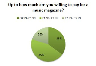
These are the results of my questionnaire based on the response given by a focus group of 20 people.

Based on these results I have concluded it will be best to release the magazine monthly, as majority answered that they would prefer a magazine released in this frequency.


Majority answered that they would buy the magazine for the interviews, this reveals that my magazine must prioritise interviews over other such features as news and freebies to keep the readers interested.


Judging by these results I should include more stories about unconventional (upcoming) acts, However the results are pretty close so I have decided to keep information on both types of act equal. This will not only help the magazine appeal to a wider audience if done in an alternating fashion it will provide a more interesting magazine.


The most sensible price range to place my magazine in would be £1.99- £2.99 this is because this is the price most chose that they were willing to pay. If the magazine costs too much it would put potential buyers off.


I had previously decided to include freebies with my magazine so this question was to help me find out which sort of freebies my target audience would more like to receive. The results are pretty even so naturally I have decided to come to a compromise between the three. The most sensible decision seems to be to provide the different freebies in an alternating fashion; this is because providing all three with every issue might prove to be too costly.


This question has helped me to decide which feature to bare greater importance on. According to these results the Central image is what most notice first, this means that if the central image does not attract their attention then they might overlook the magazine.


Most do not mind seeing Advertisements in the magazine. This will be an advantage because now designated areas in the magazine can be sold to advertisers earning additional funds for the magazine.


The results here show us that it is very likely the readers use a social networking site. Using such websites to offer an alternative way for readers to keep in touch with the magazine can be a major advantage. This can also be a method of freely promoting the magazines.
My proposal

I propose to make a magazine based around rock music. It will mainly concentrate on the Indie and more alternative sub-genres of rock. The magazine will update its readers about already existing and well established bands in the UK and the US such as Temper Trap, Vampire weekend and Florence and the Machine as well as regularly Informing them of the new and upcoming artists in this genre of music.
The main features of this magazine will include exclusive interviews with different artists as well as information sections that give the dates and locations on where bands will be playing in the near future. Also, each issue will also come with a freebie themed after the band focussed on for that issue.
My magazine will be primarily targeted at Males ranging from age 14-22, this is because I believe these two sub-genres of rock are becoming more and more appealing to young males. As of yet there is not yet a music magazine that focuses particularly on these sub-genres, so in affect this magazines will be filling a potential gap in the market.

Questionnaire

1.) How frequent would you prefer a magazine to be released?
· Weekly
· Fortnightly
· Monthly
2.) What would you buy a music magazines for?
· Interviews
· Freebies
· Latest news
3.) Which sort of artists do you prefer to read about
· Mainstream (well known bands)
· Unconventional (up and coming artists)
4.) Up to how much are you willing to pay for a music magazine?
· £0.99- £1.99
· £1.99- £2.99
· £2.99- £3.99
5.) Which sort of freebies do you prefer?
· Poster
· Downloads
· Free CD
6.) When looking at the front cover of a magazine, what is the first thing you notice?
· Central image
· Title
· Content
7.) Do you Mind seeing Advertisement in a Magazine?
· Yes
· No
8.) Do you regularly buy Music magazines?
· Yes
· No
9.) If yes, please state which ones?
·
10.) Are you a frequent user of such social networking sites as Facebook and twitter?
· Yes
· no

Wednesday, 3 February 2010


The title of this magazine has been written in Bold capital letters, this is to ensure it is legible from a distance. The font chosen is very sharp and angular. There is an exclamation mark at the end, use of this graphological feature helps to connote the loudness and excitement associated with the music title serves to represent. The title is in black and worn, also a smashed affect has also been used. Rock music is a very modern style of music and considered very dark, hence the appropriate use of the colour black. Rock music is also associated destruction, so the worn styling and smashed effect are also an appropriate addition. The title is the onomatopoeic sound of a guitar being strummed. With the guitar obviously being one of the key instruments within rock music, again we see the title making it apparent to the audience what type of music the magazine is based on. These should appeal to the audience because it relates to the genre they are interested in.

The readership of Q magazine is slightly older, aged 22-24. This is clearly connoted by the more sophisticated styling of the title block. The Font chosen is very swarve and curvy, this shows that the magazines content will be serious and be more focused on the intellectual side of things.
The Name of this music magazine is Q, also known as queue. This is a title that tells the viewer that the magazine is based on music because queuing is an action associated with it. The colours chosen for the title are red and white which are vibrant colours, red usually a colour associated with prestige. Both the colours also contrast making it a very clear and visible title.

Monday, 1 February 2010

College magazine Contents page draft
College magazine front cover


Friday, 29 January 2010

4 images i took for my college magazine


Sunday, 11 October 2009

Audiences & Instituations

Bauer


Bauer Publishing group http://www.bauer.co.uk/


The Bauer Publishing Group was founded in Hamburg 1875 by Johann Bauer. Under the management of four generations of the Bauer family, The Bauer Publishing Group has grown from its humble beginnings as a printing house into a worldwide publishing empire comprising 282 magazines in 15 countries and annual turnover of 1.79 billion Euros.

Magazines endorsed by the company:
  • Bella
  • Take a break
  • Eat in
  • That’s Life
  • TV choice
  • Twist
These magazines are mostly based on TV soap dramas and gossip so is mainly aimed at older women and young girls.

IPC


IPC Media http://www.ipcmedia.com/


IPC Media is a leading UK consumer magazine publisher. They claim “Almost two in every three UK women and over 44% of UK men read an IPC magazine.” That's almost 26 million UK adults.

Magazines endorsed by this company:
  • NME
  • Wallpaper
  • Nuts
  • Motor Boats Monthly
These cover a broader range of topics. Both niche and mainstream magazines that appeal to readerships consisting a variety of people for example NME appeals teens, Nuts appeals to male young adults and Motor Boats Monthly appeals to middle-aged and older men.

BBC


BBC magazine http://www.bbcmagazines.com/


BBC is a very well known broadcaster, known for their BBC channels and radio stations. But they also have many magazine titles to their name

Magazines endorsed by this company:
  • BBC History Magazine
  • Doctor Who Adventures
  • CBeebies Weekly Magazine
  • Top Gear
Like IPC publishing BBC magazines are aimed at a variety of people. Also some magazines have a television program to directly relate to the magazine. This is a good example of how a company can use many forms of media for one thing.

Dont Judge a book by its cover...

...Unless it's a magazine


An editor’s main concern is the magazine’s front cover. The front cover is very important because it should instantly convey to a viewer what the magazine is about and also it must be unique enough in design to make it stand out on the shelf. For already well established magazine brands, magazine front covers must maintain certain conventions (for example magazine title font) so that it is easy to recognize by regular readers.

With Kerrang! magazine the editor incorporates a variety of features into the front cover to ensure the magazine appeals to a larger readership. Kerrang! is a rock music magazine and rock is a largely spanned genre with many subgenres to its name. The editor ensures that everyone who enjoys the genre is addressed by showing on the front cover that many of these subgenres, for example punk and indie, are included in the magazine.

Freebies and collectibles are another main selling point of this magazine, this is because the magazines readership mostly consists of teenagers and teenagers respond very positively to gifts that allow them to express their interests. This is why such as gifts as stickers posters and themed calendars are very popular. Kerrang! magazine have also published special edition issues witch feature alternate front covers, this introduces a collective element to the magazine which engages new readers as well as appealing to existing ones.
Around four times a year a free CD is also issued with the magazine. Whilst this does boost magazine sales greatly for that issue this cannot be done so frequently because including cover mounted CD’s is a very costly production and as a result would raise the overall cost of the magazine. Since Kerrang! is weekly magazine so a price increase could see sales of the magazine drop drastically.

Mixmag is a dance magazine that uses a cover mounted CD’s as one of its main selling points. The reason why a free mix CD can be issued with every magazine is that the magazine is distributed monthly. This allows for this price of the magazine to be quite dear. When taking magazine price into consideration the target readership plays a major role. The readership of Kerrang! magazine consists mainly of teenagers, and as teenagers don’t often have a high disposable income it makes sense for the magazine to be cheaper. On the other hand the readership of Mixmag consists of older teenagers and younger adults who are more likely to be able afford the magazine.

The two most important areas on a magazine front cover are the top of the page and what it is known in the industry as the “sweet spot”. The top of the page is very important for obvious reasons; this is conventionally where the title of the magazine title/logo is placed. Peoples eyes naturally start viewing a page from the top, but also placing the magazine title or logo here ensures it will still be visible on a shelf where other magazines might be obscuring the rest of the cover. The sweet spot is also another very important area because after surveying the top, peoples eyes then naturally move down to this area located in the middle-right of the cover. This area is used to display the most enticing information such as advertising exclusive interviews.

Editors of magazines are always looking to accomplish two things with the magazine front cover. The first thing is reassuring the reader. Reassuring the reader means telling their readership that they are still the same magazine that offers the same content they are accustomed to, this is done by maintaining certain conventions or keeping a house style. Although magazines must uphold these certain conventions the second thing editors try is to do is something different. By doing something different they offer something new to their readership which stops them losing interest in the magazine as well as stopping the magazine from becoming repetitive.

Thursday, 24 September 2009

Representation of Jennifer Lopez Cover - 4

Above we see Jennifer Lopez on the front cover of People magazine. People magazine is an American magazine that concentrates on human-interest stories based on celebrities.

Costume: Very different to costumes she is wearing on the covers of the other magazines, this costumes is not to make her look sexy and not to make her look particularly fashionable. This outfit, as well as her slightly messy hair, does well to portray her in a casual way. Her being presented in such a way shows that although she is a celebrity she is just like any other mother. This is a very important statement for this image to make because it really forges a connection between any mother viewing this cover page and Jennifer Lopez.

Facial expression: In this image she is smiling broadly which on one hand does make her seem attractive but put into proper context of the whole image it shows she is a happy mother of two children. It also conveys her as having a kind and friendly nature.

Body language: She looks as though she is sat back which shows she is relaxed and comfortable, again conveying the happier side of being a mother. Her arms are wrapped around her children as to again convey her motherly aspect and show her children are also the focus of the image.

Framing and camera shot: A Mid-shot has been used here because her children are a very important aspect of the shot, so the closer the shot the better visible the children are. Use of the mid-shot brings us closer to her and shows us she is inviting us to look at her children showing that she is a proud mother.

Setting colour and lighting: This shot has been set of a sofa, which is a casual scene that everyone can relate to, and by choosing a setting that is so easy to identify with readers will feel clearer link established between them and the celebrity. The colours used are all of a subdued nature, mostly whites, browns and pale blues, these help produce a calm and soothing atmosphere to the picture witch is strengthened by both children seeming to be asleep, this also adding a tranquil feel to the atmosphere. The lighting also works with the colour palette chosen for this image, the lighting is very soft and there are no dark shadows.

Representation of Jennifer Lopez Cover - 3

Cosmopolitan is an internationally distributed magazine for women. The magazine includes articles based on includes articles on relationships and sex, health, careers, self-improvement also celebrities fashion and beauty.

Costume: on this cover she is outfitted with a summery dress with almost floral looking patterns on it. Whilst it is not a revealing as the outfit worn on the cover of FHM it does reveal key areas which build sex appeal, example being that she has quite a large amount of cleavage exposed. Her dress is very stylish and has many vivid colours such as red yellow and white, witch really catches attention of people interested in fashion.

Facial expression: she sports a more natural look here, this links to the dress pattern which does seem to be nature based and decorated with floral patterns. Her facial expression also makes it easier to see the full effects of the make up she has used which viewers might be interested in.

Body language: She seems to be more relaxed in this image, her hands are placed lower onto her thighs and her shoulders are slouched to one side. This sort of body language also links in with the theme of summer because it is a time often associated with vacationing and relaxing.

Framing and camera shot: Although this image is being used to appeal a sexy side of Jennifer Lopez like with the FHM magazine she is not the only main focus on the cover, use of a mid-shot allows the readers to see in finer details the patterning on her dress and also allows then to see how her make up has been applied.

Setting colour and lighting: All that seems to be used here for a setting is a red backdrop. The fact it is red bares many significances, for one red is a colour that symbolizes love and passion and so would be associated with such things as relationships. Red is also a colour that represents heat, which ties in with a summer theme being portrayed on the front cover. The red backdrop also matches the dress and the colour scheme of warm colours used on the cover.

Representation of Jennifer Lopez Cover - 2

FHM, which stands for “For Him Magazine”, is a men’s lifestyle magazine. It is a magazine that concentrates on the interests of men, for example attractive female models, sports, gadgets, cars and fashion.

Costume: On this cover Jennifer Lopez is wearing something very different in comparison to what she was wearing on the front cover of People magazine. On cover of that magazine she wore something that was not very revealing yet managed to define the contours of her body, here on this cover she is wearing something very exposing so there is nothing to hide. What she is wearing seems to be a cross between lingerie and a bikini which can be seen as fusion of two very intimate items of clothing for a woman. This costume therefore aims to highlight her sex appeal by portraying her in a very intimate way witch should grab the attention of the male target audience.

Facial expression: Her facial expression here is serious which some might find to be very attractive. Her eyes are focused directly towards the reader and therefore, like People magazine, she is establishing a direct mode of address with the viewer inviting them to read the magazine.

Body Language: Here we see Jennifer Lopez kneeling down with her hand on her hip; this pose has been composed to gain different effects. Similarly to her pose on the People magazine cover the hand on the hip connotes authority which does conveys her status as a very successful woman yet the fact she is kneeling also makes her seem submissive.

Framing and camera shot: A long shot has been used for this image; this is because it allows her whole body to be captured in the shot, which is what is meant to attract readers of a specific demographic. Use of long shot also creates distance between us and the celebrity which is almost like a tease for the viewers. Also part of the framing is the fact she is placed over the title of the magazine, this serves to emphasize her importance.

Setting colour and lighting: The setting is composed off a backdrop and a floor of sand. The backdrop is blue which not only matches what she is wearing but mimics the calm blue off the sky often associated with beaches. The setting has been designed to have the feel of a beach because this link in with the idea of fun and makes her outfit appropriate. The lighting used for this shot also seems to be trying to recreate an authentic beach atmosphere by the lighting being very soft as though it were coming directly from the sun.

Wednesday, 23 September 2009

Representation of Jennifer Lopez Cover - 1

InStyle magazine is a women’s fashions magazine distributed both in the United States and the UK. As well as fashion the magazine offers articles about beauty, home, entertainment and celebrity lifestyles.

Costume: On this cover Jennifer is modeling a highly fashionable black and white dress. The colours are bold and the black highly contrasts with the cover’s white background which helps her stand out against it and therefore emphasizes her importance. Also by her modeling such a high end dress style she is communicating to the audience of the magazine she is a very fashionable person.

Facial expression: On this cover she is giving a warm smile which portrays her as a friendly celebrity, this look also makes her look attractive. The smile coupled with her staring out directly at the viewer establishing a positive mode of address which helps create a friendly relationship that invites them to read the magazine.

Body Language: Here we see here posing with her hand on her hip. Normally this sort of pose would convey dominance and authority but because she is slightly turned to the side and slightly pushing her hip out it softens the pose. As opposed to conveying a full on dominating nature we feel as that Jennifer Lopez is a strong and mature woman yet friendly and flirtatious.

Framing and camera shot: Here a mid shot has been used. Use of this shot type helps bring the reader closer to the subject of the image witch in this case isJennifer Lopez. So in effect here the shot type helps strengthen the mode of address established by her looking directly at the viewer.

Setting colour and lighting: The setting seems to be a plain white backdrop, this mimics a photo shoot setting, and they are often used to maintain the focus on the model. Also because white is a very reflective colour the backdrop provides vivid and dynamic lighting as seen in the image for this cover.