The masthead
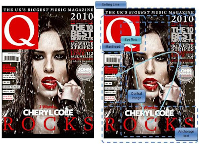
The masthead of this magazine is placed at the top left. This is a very conventional area on the front cover of a magazine to place the title because naturally when viewing a page we start by looking at it from the very top. The most pertinent colour of the masthead is red which is a very noticeable from a distant and contrasts against the dark central image. The Font used for the Title is curvy and well presented, which makes the magazine look sophisticated. This is a trait that will be desired by readers that want to reader a magazine with serious articles.
Central image
The central image is a close up shot of Cheryl Cole. In this image she is staring directly out at the reader which establishes a direct mode of address with them. This makes a her look as though she is approachable therefore inviting the viewer to buy and read the magazine. Additionally this is a very high quality image, the lighting suggests it was shot in a studio. Having such a high quality image on the cover suggests that the contents of the magazine are also of a high standard. The image has also been edited in such a way that the image seems monochromatic, the lack of colour and dark shadows help portray the new Cheryl as being quite dark. Also the lack of colour helps accentuate the red of her tongue and lipstick. Choosing this blood red helps tie the image in with the masthead and the anchorage text and gives the singer a dangerous edge. Using the dark Helps build the image of a dark and dangerous woman which really conforms with ideologies behind a real ‘rock-chick’. The whole image is also an homage to the film sin city, the way Q are aiming to portray the celebrity is very relative to film. It seems Q are trying to tell the audience that the Cheryl is no longer that generic girl band girly band but now an powerful and independent female musician that knows how to rock.
Anchorage text
The anchorage text is both a clever pun and an intertextual reference the title of Cheryl’s new album, which goes by the name ‘3 words’. Even to provide further reference to this album Q have decided to order the anchorage text in 3 lines and present it in 3 different fonts. Providing so much reference to her album establishes that the issue will focus on the musical career of Cheryl Cole, despite the fact she has risen back into popularity for a variety of reasons, another being the fact she hosted the X factor.
Selling line
The selling line used to bargain with the reader, telling them why they should buy this magazine instead of another music magazine. In this case they have claimed to be the ‘biggest’ music magazine in the UK, this is a very worthy credential because in order to be the biggest it must be the best. This makes the reader feel as though by getting this magazine they will be getting the best new music information in the UK.
Puffs
The puffs on this magazine mainly consists of the name of different music acts spanning over a wide variety on genres. For example 50 cent representing the more R’n’B and rap side of music and then vampire weekend representing the more indie and rock.
Layout eye flow
The eyeflow for this magazine front cover is not as simple, having a full scan of it requires you to revisit certain areas to read additional information. Q have contrasted the cover is such a way that your eye is lead around the page in order of the largest feature to the smallest. The first of course being the masthead, big red and contrasting. We then move down to read the large text at the bottom and by doing so we examine the central image. Then finally our eyes move around the page to read the puffs to gain additional information about the magazine.
No comments:
Post a Comment